
Choosing a Photo for a Custom Portrait or AI Art: Why Your Favorite May Fail
A beautiful photo isn’t always the best starting point for a personalized creation. Here’s what to look for before you upload.
Published
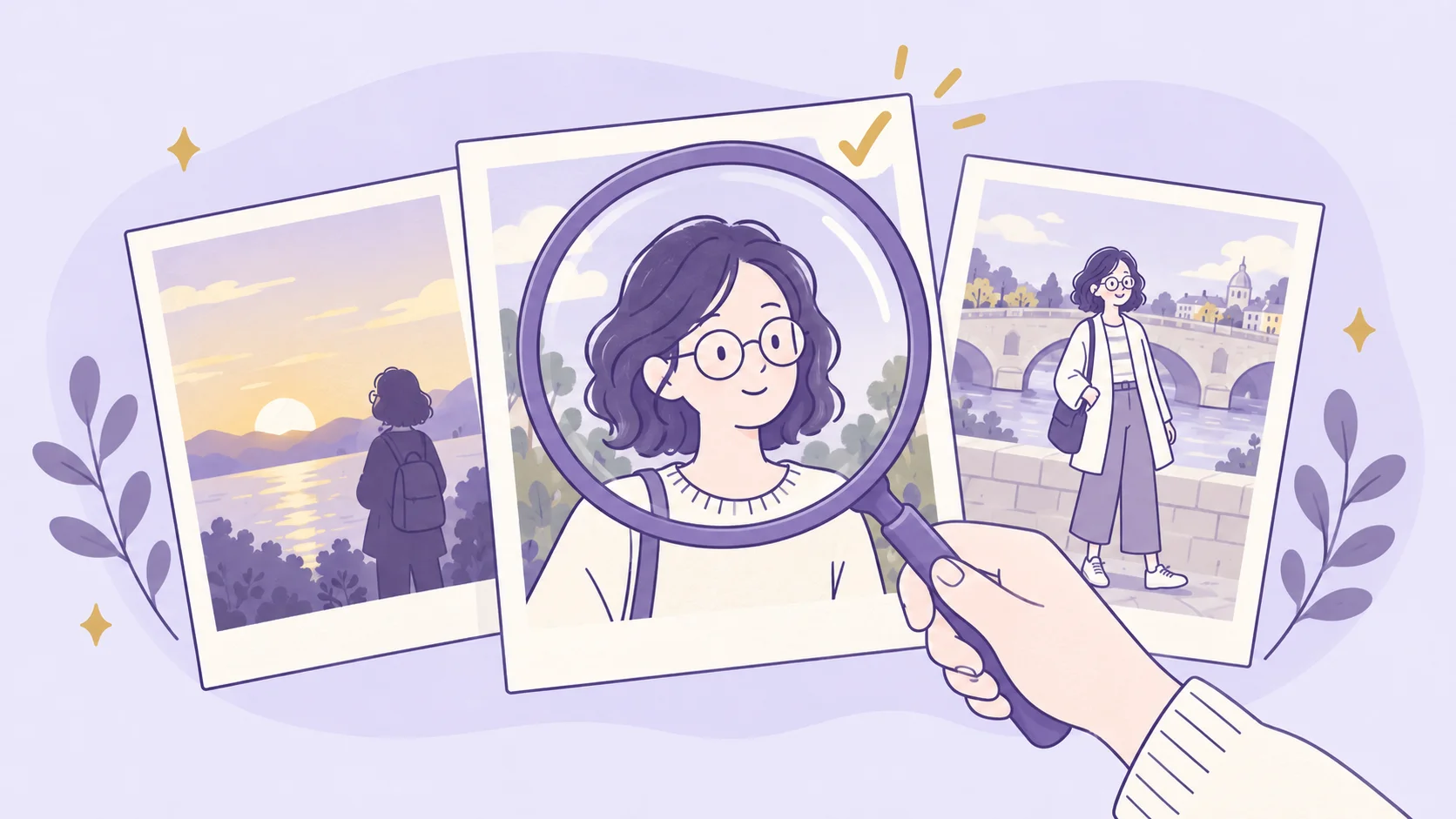
You have five photos of someone you love. One has beautiful sunset light. Another catches their biggest smile. There’s a casual picture from a family dinner, and one where they’re standing in front of a place that means a lot to both of you. Which one should you use?
If you were choosing a photo to frame, you might simply pick your favorite. When that photograph becomes the starting point for something new, the decision changes. An AI image generator might use the person’s face and replace everything else. A portrait artist might preserve their expression and pose. A personalized gift might recreate the entire moment, including the people and the place around them.
At that point the photo stops being only a picture. It becomes the information the next picture is built from.
Start with what the finished piece needs
Before scrolling through your camera roll, picture the result you want. Is it a recognizable portrait of someone in an entirely new scene? An illustration that keeps their familiar clothes and hairstyle? Or a keepsake that brings back one particular day?
For a realistic portrait, the face, the expression, and other distinctive features may matter most. In a highly stylized cartoon, the facial features may change a great deal, while the hairstyle, glasses, or clothing keep the character recognizable. If the piece is about a shared memory, the setting can matter as much as the people.
It helps to sort the photo into three parts: what you want to preserve, what you’re happy to change, and what the artist or AI tool will create from scratch.
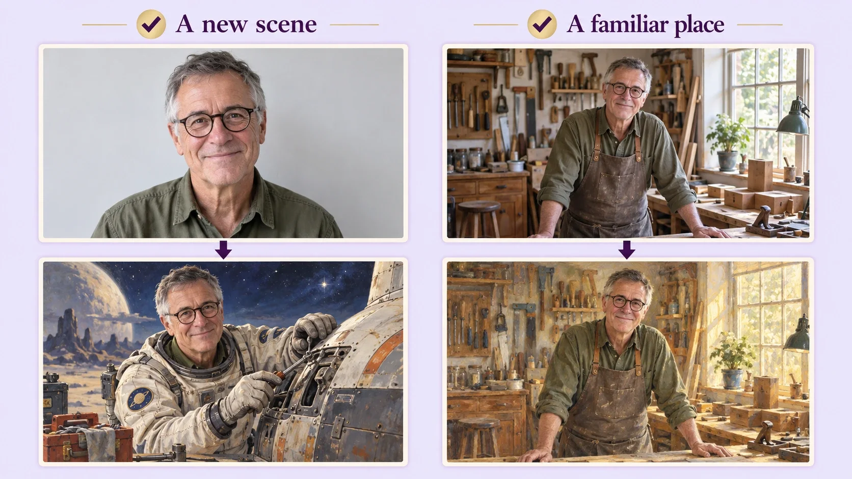
Imagine turning a photo of your father into an illustrated scene of him repairing a spaceship. You’ll want his face and familiar glasses to stay recognizable, but there’s no need to find a picture of him in a spacesuit; the new scene supplies that. If you’re commissioning a painting of him in his favorite workshop, a photo that clearly shows the room and his usual clothes gives the artist far more to work with. The same person can need two quite different reference photos, depending on the result.
Recognizable doesn’t mean photorealistic
When people think about likeness, they usually think of the eyes, nose, and mouth. Those matter, particularly in realistic portraits, but they’re only part of what makes someone look like themselves. Think of how quickly you recognize a friend across a street: the hairstyle, the shape of their head, the way they wear their glasses, the jacket they always seem to have on.
Those cues matter even more in a simplified drawing style. A cartoon may turn the eyes into two small dots, simplify the nose, and exaggerate the smile, and the character can still feel unmistakably like your friend if the hair, face shape, skin tone, and familiar accessories survive. If the design also keeps their clothes, a favorite outfit adds one more link to the real person.
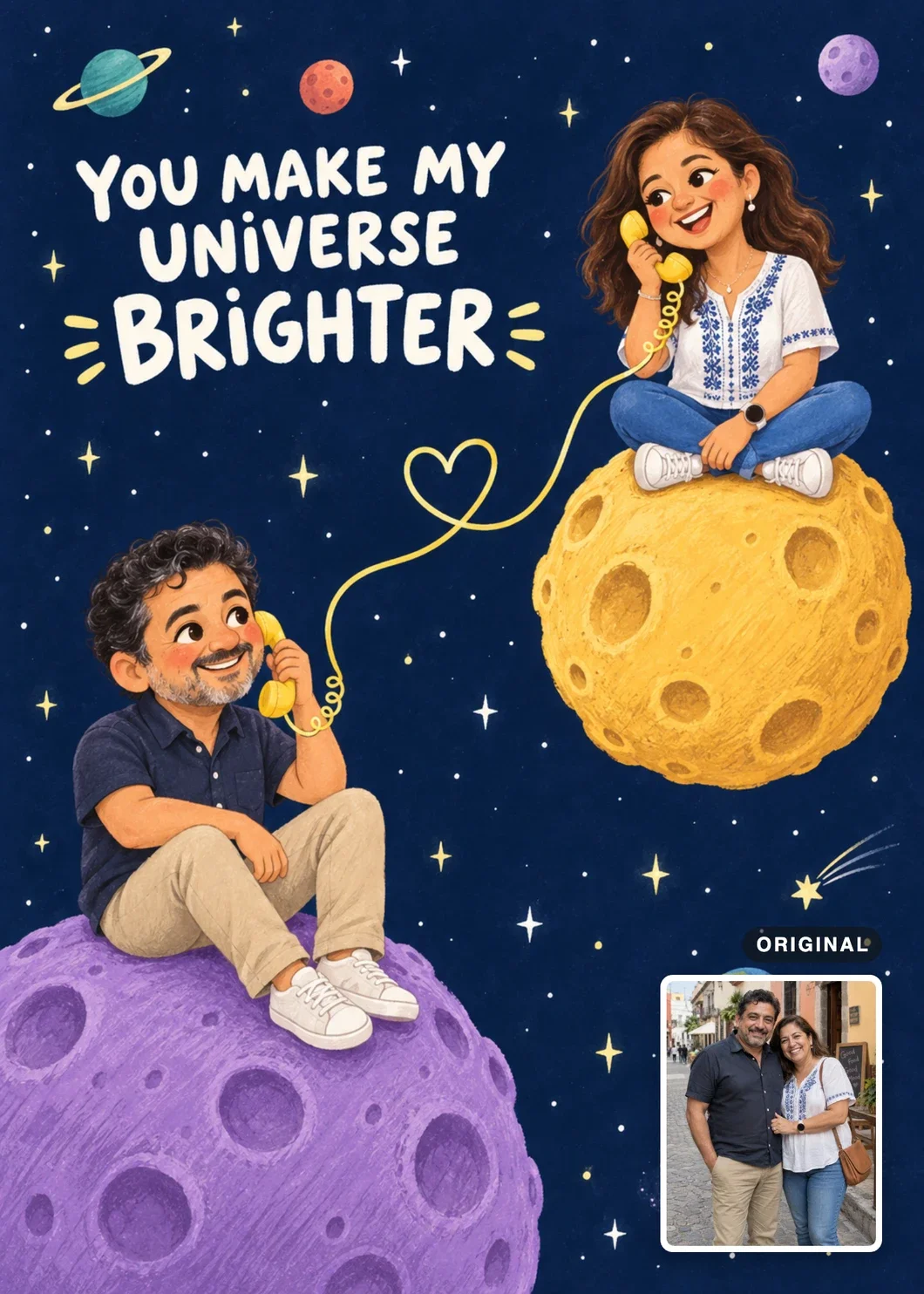
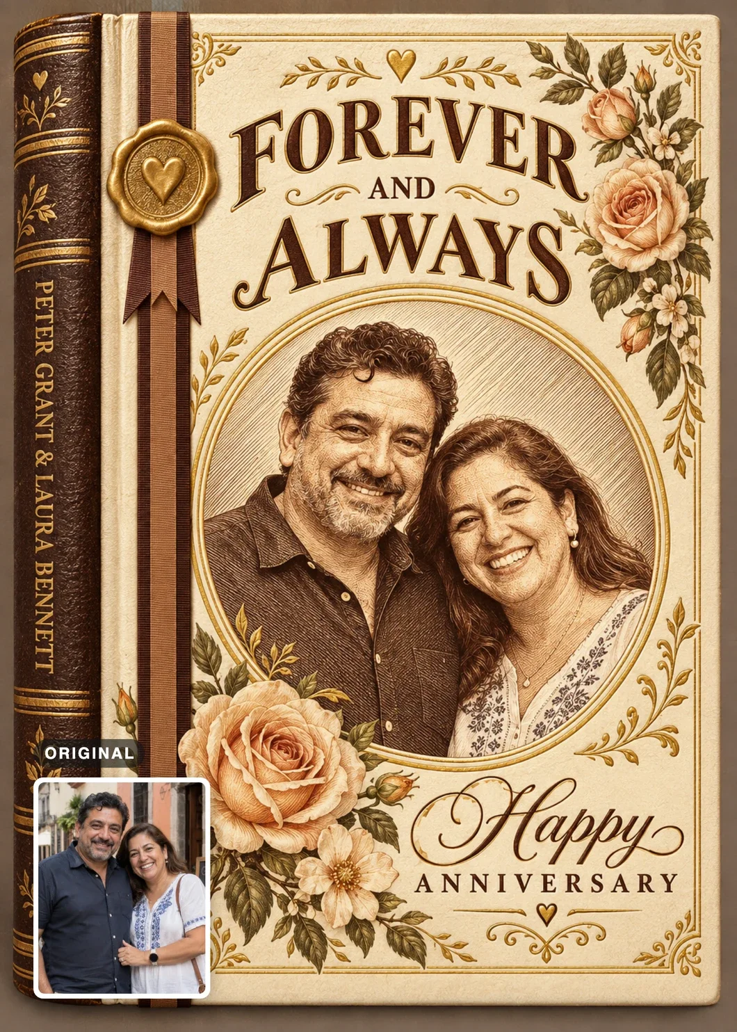
You can see this in three of our designs, all made from the same photograph of one couple. Universe Calling turns them into small storybook characters. Their faces are simplified, so the navy shirt, the embroidered blouse, and their hair carry much of the likeness. Vintage Love Story keeps their faces and expressions in a sepia engraving. Rainy Filmstrip Memories keeps a black-and-white photographic look and brings the old-town street from the original into its smaller frames.
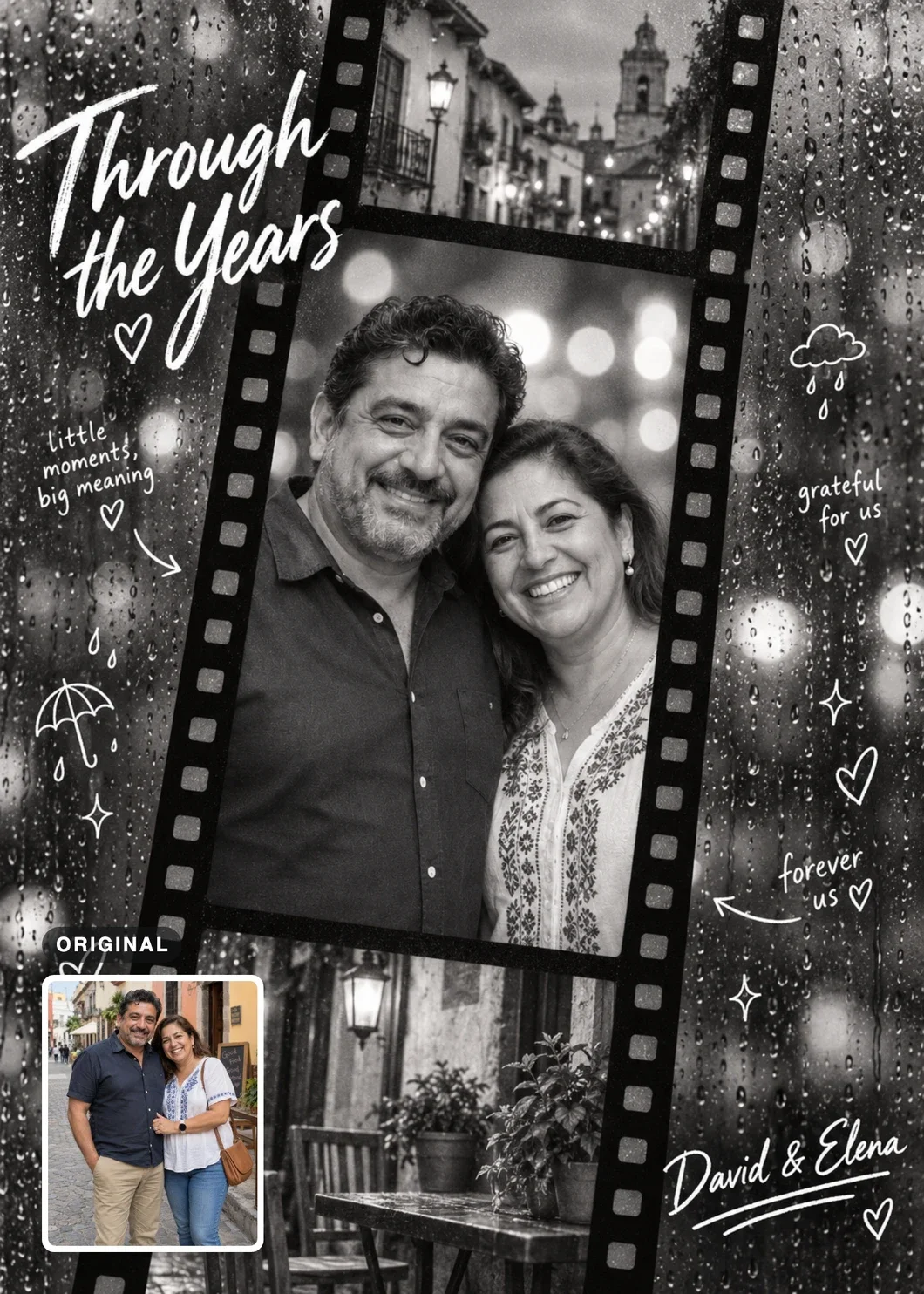
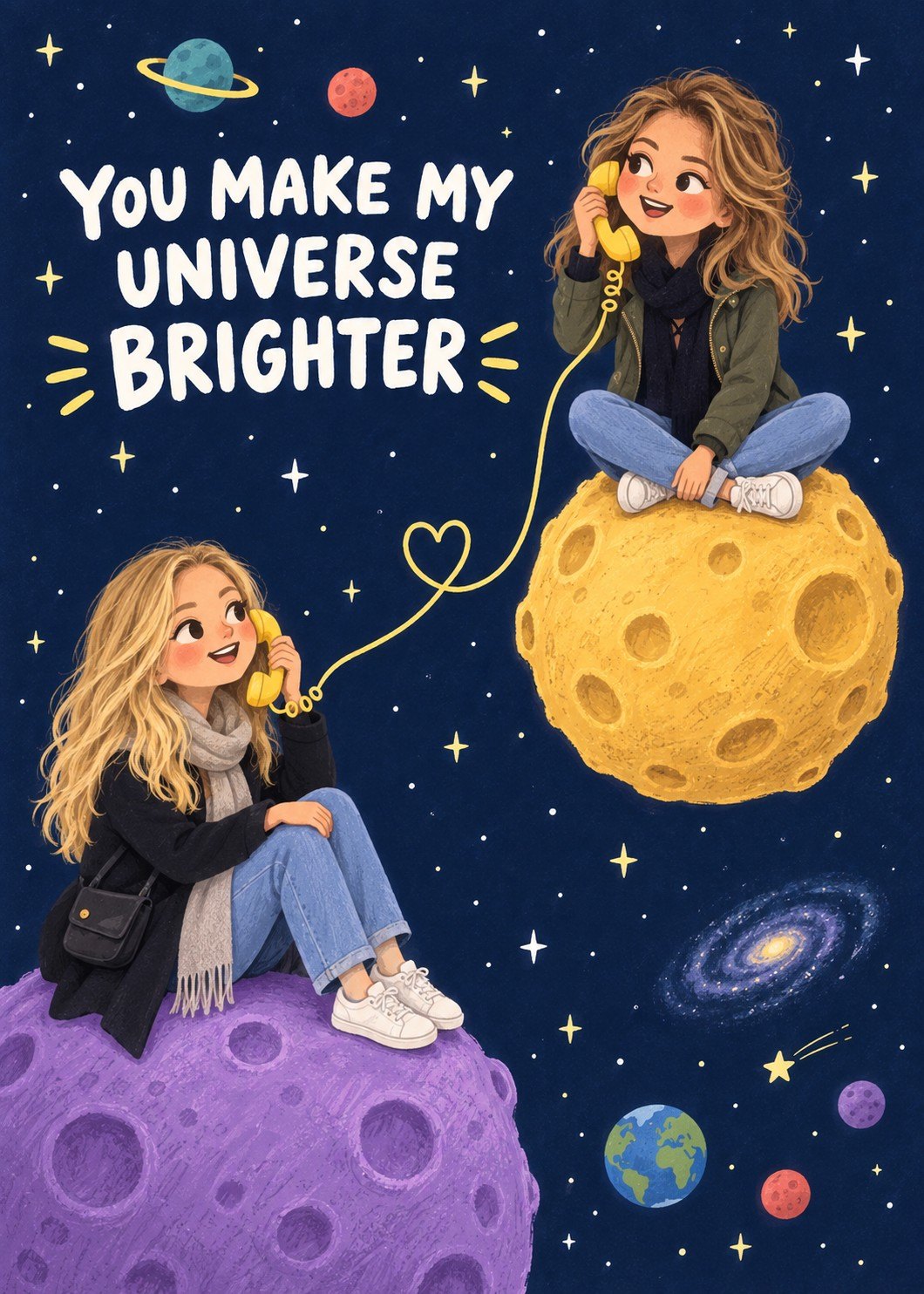
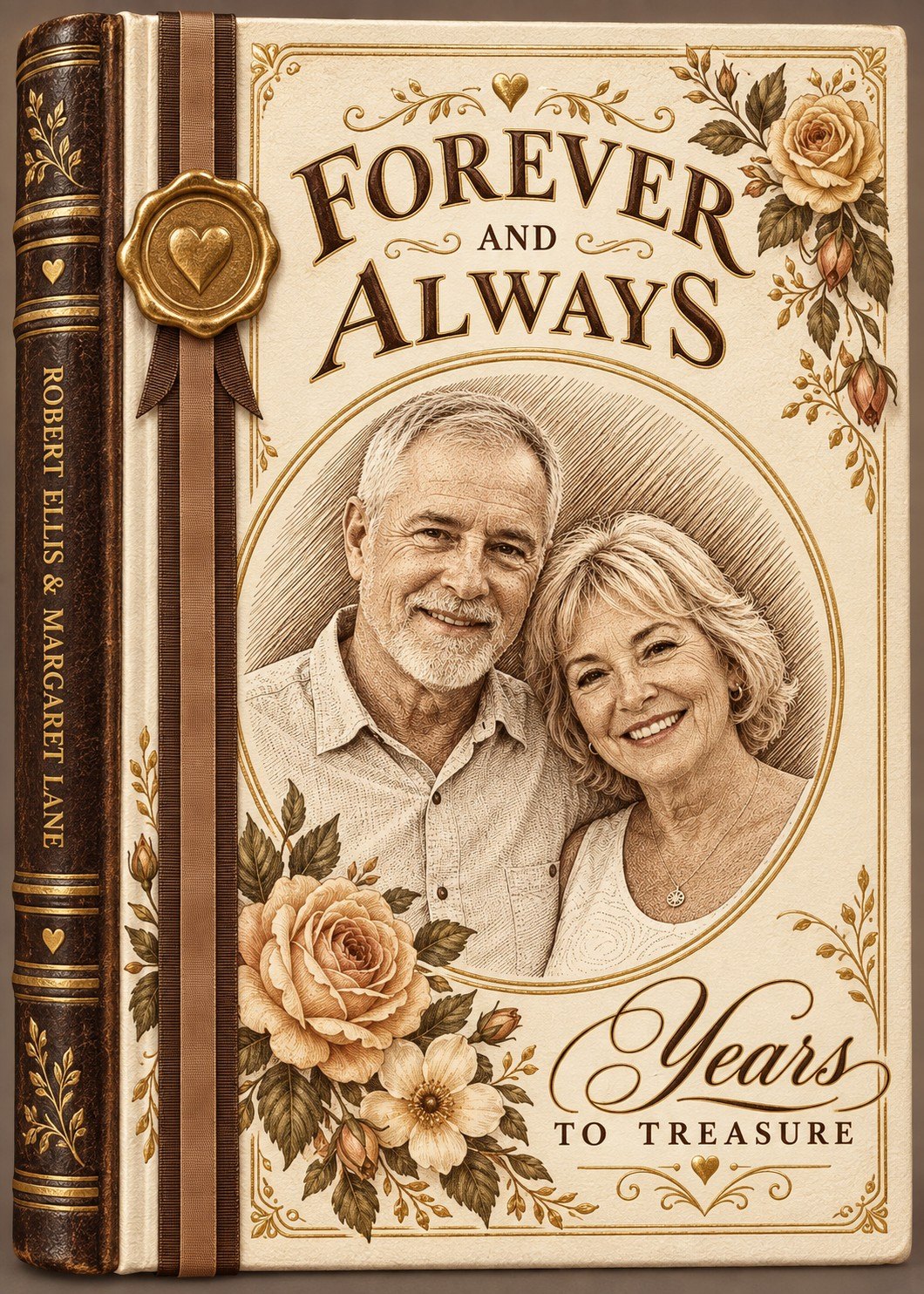
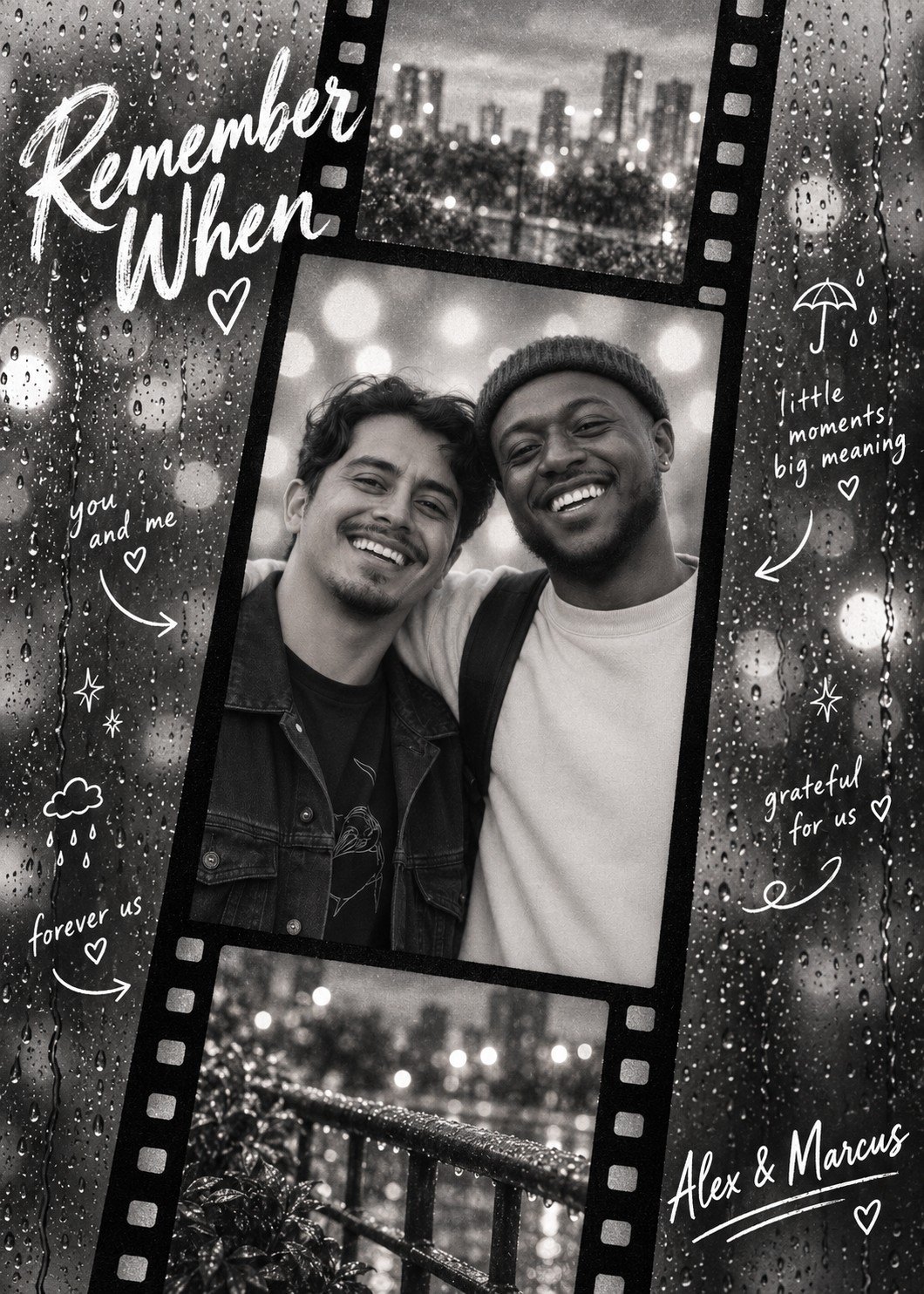
Some designs go the other way with clothing. Birthday Photo Booth gives the person a different playful outfit in each of its eight panels, so recognition rests on the face and hair rather than on what they wore that day.
Before choosing, ask which details make the person recognizable to someone who knows them, and look for a photo that shows those clearly. The most flattering picture isn’t necessarily the best likeness. Heavily edited selfies are a common trap: a beauty filter that enlarges the eyes, reshapes the jawline, or smooths away distinctive details gives the creator a less accurate picture of the person. Start from an unfiltered original whenever likeness matters.
One more thing is worth knowing about AI tools. They can misread a person’s appearance when familiar cues don’t match their assumptions, so a woman with very short hair or a man with long hair may come out looking different from the photo. If the tool accepts written guidance, describe the person’s actual appearance and gender presentation instead of leaving the model to infer them from hair or clothing.
Keep the background, or let it go
A simple background is common advice, and it’s often right. It just isn’t always right.
When the finished piece replaces the setting, a clean background keeps attention on the person. A plain wall, an uncluttered room, or an open outdoor space all work well. If you’re taking a new photo, Portrait mode on a phone can soften the background and separate the person from it. Check the edges afterward: strong artificial blur can eat into wisps of hair, the rims of glasses, or parts of the silhouette. You want the background quieter without losing details that help identify the person.
When the setting belongs in the piece, the advice reverses. Imagine a portrait to remember a trip with your best friend: the two of you beside a familiar bridge, in the courtyard of a favorite café, or on a beach where you spent an unforgettable afternoon. If that place is part of the gift’s meaning, it needs to be visible in the reference. A tight portrait against a blurred background may capture both faces beautifully and say almost nothing about the place. Choose a photo that balances the people with the scene, so the faces are still clear and the landmarks, buildings, or landscape have enough detail to work from.
Some of our designs are built on exactly this. On Stitched Memories for Two, the scenery behind the two people becomes a small keepsake stamp. On Rainy Filmstrip Memories, it reappears in the two smaller film frames. For designs like these, a meaningful, visible setting is part of what makes the card personal.
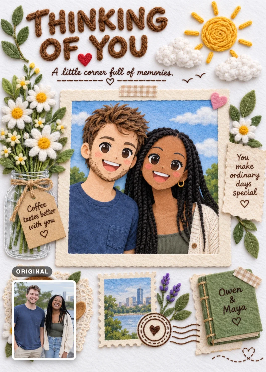
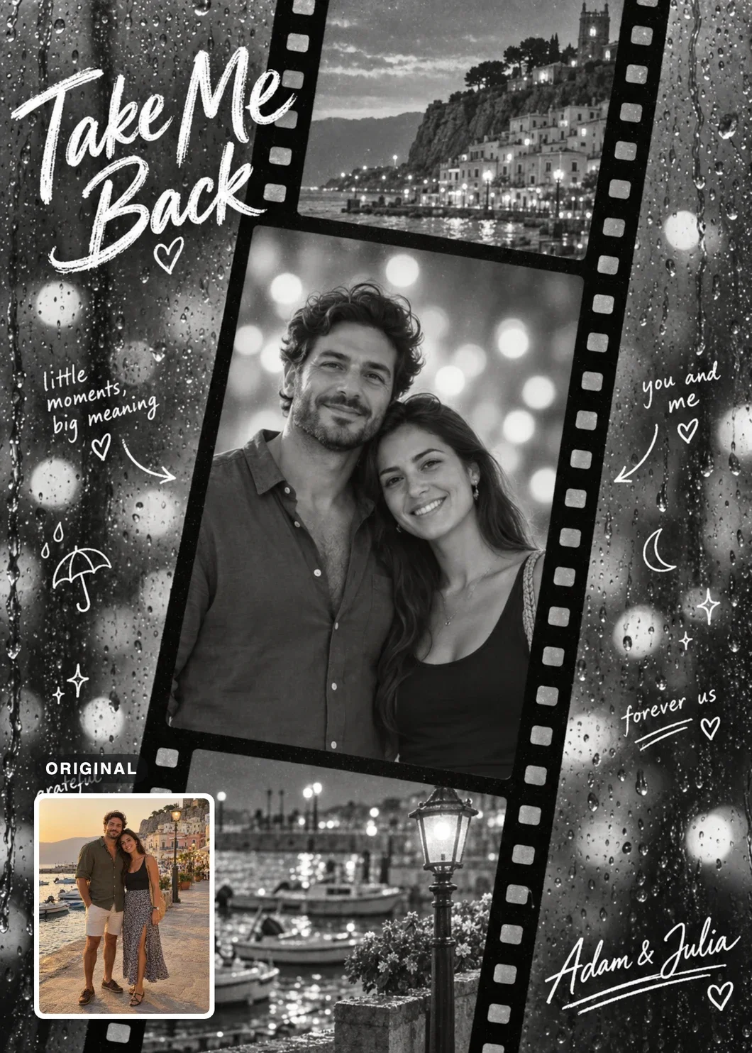
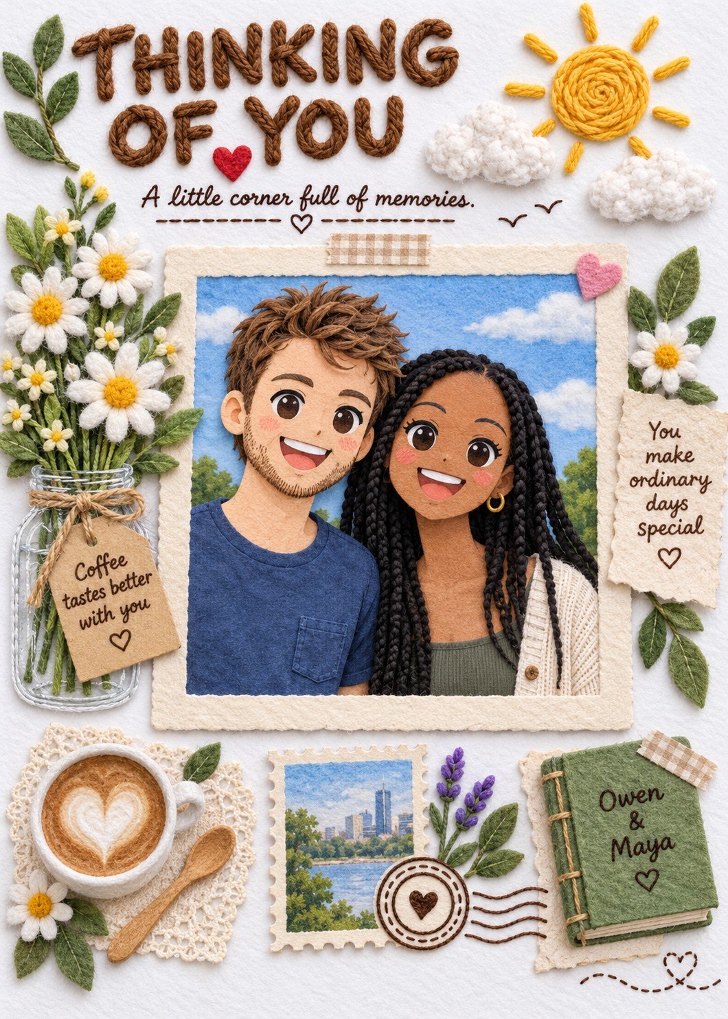
So before cropping out a messy background, ask whether you’re removing a distraction or removing part of the story.
Match the framing to what the result needs
A photo can show the right person in good light and still leave out something the design needs. Framing, or how much of the person is in the shot, decides a lot of that. A headshot gives priority to the face. A chest-up portrait adds the neck and shoulders; a waist-up photo adds more clothing and body; a three-quarter photo reaches roughly to the thighs or knees; and a full-body photo shows the whole person. None of them is automatically the best reference. For an illustrated face or a small portrait medallion, a clear headshot or chest-up photo may be all the creator needs. If the finished piece keeps a favorite coat, the shape of a dress, or the way someone’s hands rest, a wider photo becomes more useful.
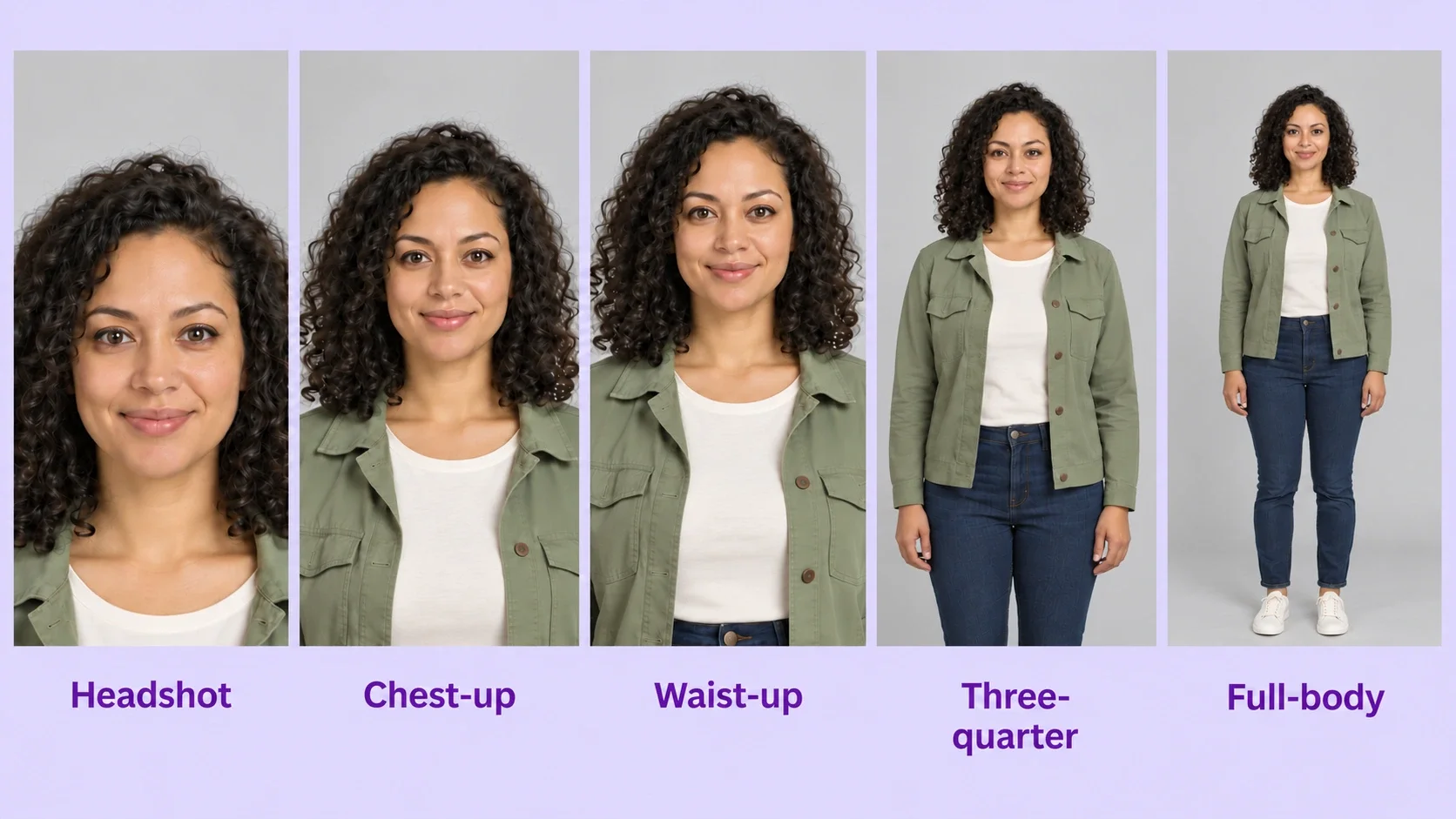
Wider isn’t automatically better, either. A full-body photo shows more of the person, but the face may take up only a small part of the image, and extra body information won’t make up for a face that is tiny or blurred. When you can, use a high-resolution original that shows the body area you need while keeping the face large enough to read. If a designer accepts several references, a clear face photo plus a wider view can cover both.
Requirements can differ even between designs from the same maker. Rainy Filmstrip Memories needs a waist-up to full-body photo, because the outfits and the setting carry over; chest-up photos and headshots don’t work for it. Birthday Photo Booth accepts anything from a headshot to a full-body photo, because it redraws the outfits anyway. AI tools, for their part, can invent clothing, limbs, or poses that aren’t in the photo. That’s useful when you want a new scene, but if you want the original details reproduced, the tool or artist has to see them.
Choose the face angle, and keep it consistent
For many portraits and AI character references, a clear frontal or near-frontal face is a practical starting point: it shows both eyes, the shape of the face, and a balanced view of the features. It isn’t always the best choice. If the finished piece shows someone in profile, a side view gives the nose, forehead, chin, and jawline in a way a frontal photo can’t, and a three-quarter view suits an illustration with a gently turned face. Where likeness matters, match the reference angle to the intended result. An artist or AI tool can create a new angle from one photo, but anything the photo doesn’t show has to be interpreted.
For a single portrait, one good reference may be enough. Keeping the same person consistent across several images or a video is a separate challenge: they turn their head, walk away, and reappear from another camera angle. Some AI workflows use a character reference sheet (also called a character turnaround) showing the same person from the front, at three-quarters, in profile, and sometimes from the back, which gives the tool more information about the face, hair, clothing, and proportions.
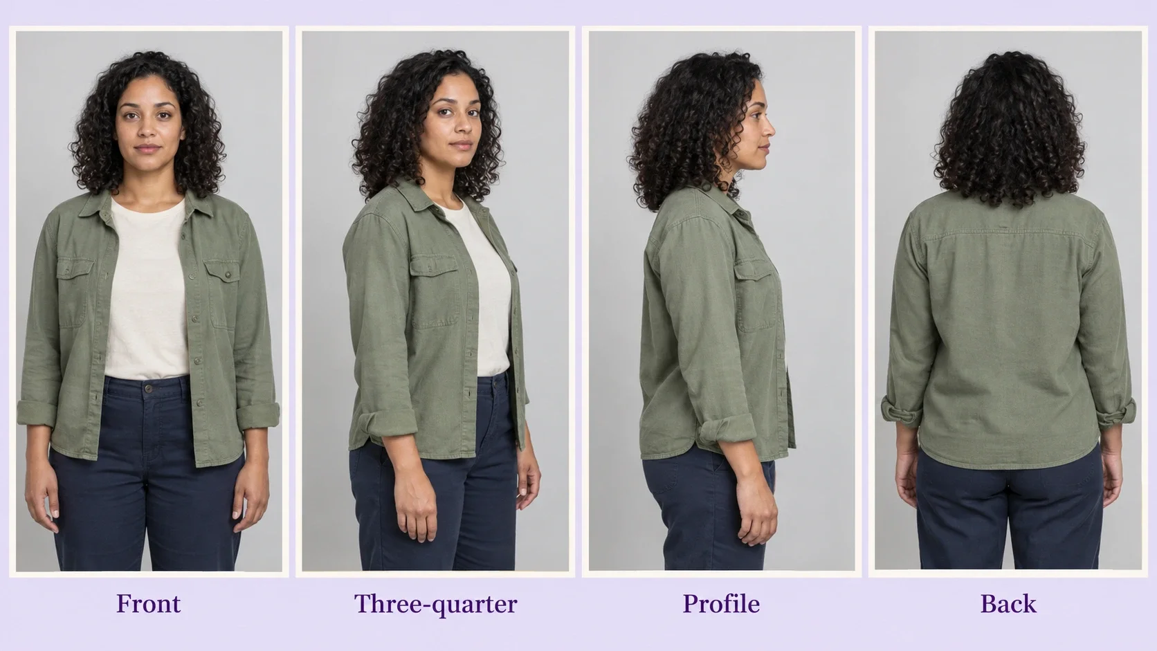
Not every tool or project needs this, and some tools keep a character steady from a single image. When the appearance starts drifting between shots, though, several consistent references can help, provided the tool accepts them. The key word is consistent: a front photo from today, a profile from ten years ago, and a full-body shot with a different hairstyle give the tool conflicting information. Choose references that show the same intended appearance.
With several people, the relationship is part of the picture
Choosing gets more involved when the piece includes two people, a couple, or a whole family. Start with the basics: everyone who needs to appear should be in the photo, with faces large enough to tell apart. Avoid shots where one face is hidden behind someone’s shoulder, someone is cut off at the edge, or the people at the back are too small to recognize.
Counting faces isn’t the whole job. The photo also shows how the people relate to one another. Who stands beside whom? Are they leaning together? Is someone holding a child? Are there clear differences in height? Does a pet belong with one particular person? An artist or AI system may read all of this when it builds the composition.
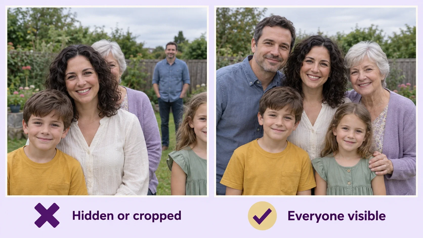
If you want to keep a family grouping, a photo where everyone is already arranged naturally is a strong starting point. People don’t need to stand in a straight line; they should be close enough to feel like a group, with faces and important features visible. Some designs rearrange everyone into a new pose, and even then the original positions can influence who ends up on which side and how each person is drawn. Universe Calling, for example, places two people on separate planets and redraws their poses, so it asks for a photo with both of them facing the camera. Other workflows keep the original arrangement much more closely.
If you plan to combine people from separate photos, don’t assume the tool can do it. Some services accept several reference images; others need everyone together in one photo. Check the actual input requirements before you assemble your references.
Check the result where it will end up
One last distinction can save unnecessary photo hunting: what the source photo needs is not always what the finished piece needs. A design printed on a mug, a T-shirt, or a greeting card may call for simpler shapes, stronger contrast, or fewer fine details. Fabric texture changes how a design looks, and a curved mug has its own layout to consider. That doesn’t mean you need a more colorful or higher-contrast photo. A softly lit portrait can be an excellent source for someone’s face, and the designer can then adjust color, contrast, and detail for the material.
Before commissioning a physical gift, ask the maker what they need from the photo and what they will handle in the design, and check the final size, crop, and printing method. A reference that works beautifully for a large portrait may need a simpler composition on a very small object. If you’re making something yourself, look hard at the first result before calling it finished: is the person recognizable, did the important details survive, and does it work at the size it will be seen? For a printed card, one test print shows what the screen hides, and our guide to printing your card covers the differences between printing at home, at a print shop, and as a photo.
The practical lesson from all of this is simple: check what a particular design promises to keep before you choose your photo. A picture that’s perfect for one piece may be the wrong one for another, even with exactly the same people in it. If you’re designing the card itself, How to Design a Personalized Greeting Card covers the decisions beyond the photo.
A good reference photo doesn’t have to be professionally taken, perfectly posed, or even your favorite picture. It needs to show the right things clearly enough for the piece you have in mind. Sometimes that’s a face and a familiar expression. Sometimes it’s the clothes someone always wears, two people standing close together, or the place where a memory happened. Choosing well means knowing which of those details gives the new piece its meaning.
At Fond & Fold, that understanding shapes how we develop every card. The scene, visual style, composition, and words are worked out before a design reaches the shop, and each design comes with its own photo guidance instead of one rule for everyone. You choose the design that feels right, bring a photo with the details it needs, and preview how the two come together. The artwork is planned in advance; the people and memories that make it personal come from you.
We hope the finished card gives its recipient a small moment of recognition: a familiar smile, an unmistakable hairstyle, or a place that brings back a whole afternoon. The person may appear as a watercolor portrait, a playful character, or a figure in a new scene, but something in it still belongs to the two of you.
The best reference photo isn’t always the most beautiful one. It’s the one that tells the next picture what to remember.