
How to Design a Personalized Greeting Card: Where to Start and What to Decide
Start with the person and the reason for the card, then work through the idea, the photo, the cover, the inside, and the printed card.
Published
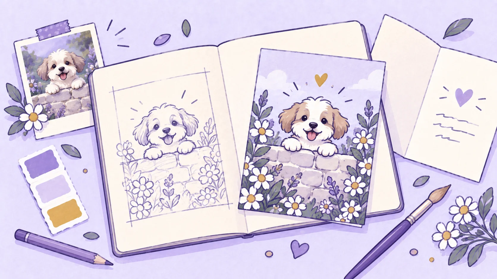
A greeting card you design yourself is one of the more personal things you can give. It takes time and attention, and the person opening it can usually tell: the picture, the words, and the small details were chosen for them and nobody else. Done well, it becomes a small moment the two of you remember, and sometimes a card that stays on a shelf for years.
A personalized card can begin with almost anything: a photograph you want to use, a joke that makes you think of one person, a memory you want to turn into a picture, or simply a feeling you want the card to carry. The tempting next step is to start choosing colors, fonts, flowers, and borders. Those decisions get much easier once you know what the card is trying to say.
A good card rarely comes from adding as many personal details as possible. It comes from deciding which details matter, what the recipient should notice first, and how the picture, words, and format can support the same idea. The six steps below follow the order we have found works best when we develop our own card designs, and thinking them through before you begin saves a surprising amount of rearranging later.
Start with the person and the tone
Before deciding what the card should look like, decide who it needs to work for. The same birthday can call for a loud joke, a quiet message, or something nostalgic, depending on the person receiving it. A thinking-of-you card sent during a difficult week has a different job from one sent because an old friend crossed your mind. The occasion gives the card context; the person and the relationship give it character.
Think about what they tend to enjoy rather than putting them into a broad category. Someone who loves being the center of a birthday celebration may suit bright color and playful exaggeration, while someone who dislikes fuss may appreciate a simpler picture and quieter wording. A friend with a dry sense of humor may enjoy a visual joke that would feel odd on a card for a sentimental parent. Treat these as clues for a direction that will feel familiar to the recipient.
It helps to name the tone before you name the style. Warm, playful, understated, celebratory, affectionate, nostalgic, or dry all suggest different visual decisions. Once the tone is clear, you have something to judge later choices against. A beautiful illustration can still be wrong for the card if its mood does not match what you want to say.
Find the idea before decorating
A list of attractive ingredients is not yet a card. “Flowers, pastel colors, handwritten text, and a dog” tells you what might appear on the page, but not how those things belong together. “A person and their dog peek around a flower-covered garden wall to say hello” gives the card an idea that the picture and the wording can both support.
For some cards, the idea comes from the recipient: a hobby, a pet, a favorite place, or a personality that suggests a scene. For others, the starting point is language: a pun, a deliberately silly metaphor, a phrase they always use, or a joke that can become visual. A quieter card might be built around a much simpler concept, such as turning an ordinary photograph into a gentle garden portrait or making one shared memory the focus of the whole piece.
Try to describe the card in one sentence before worrying about small visual details. If the sentence is hard to write because the design is trying to do four unrelated things, the picture will probably feel just as divided. The idea does not need to be elaborate. It only needs to be clear enough that you can later ask whether a color, prop, line of text, or decoration is helping it.
Decide what makes it personal
Personalization does not have to mean a portrait on the cover. A card can feel personal because of a name, a shared joke, a place with meaning, an important date, a pet, a phrase between two people, or the message inside. Decide which of those details actually carry the connection before you choose how prominently they should appear.
If the design depends on a person or a pet, the source photograph becomes an important part of the process. The most useful photo is not necessarily the most polished one; it is the one that clearly shows what the design needs. For a portrait-led card, a recognizable face, hairstyle, glasses, facial hair, skin tone, and other distinguishing details matter more than an impressive background. Even light and a clear view of the face give you more to work with than a dramatic photograph where important features disappear into shadow.
The photo does not have to dictate the finished composition, either. Think of it as information: decide what you need to preserve from it, then let the card decide the framing, scale, pose, and surrounding scene. You can see this on Starry Night Anniversary. Both source photos below are simple daytime snapshots, taken close and in everyday clothes. The finished cards keep each couple’s faces, hair, and closeness, and the design supplies the rest: a full seated pose on a stone terrace at night, cream outfits, and sparklers in their hands.
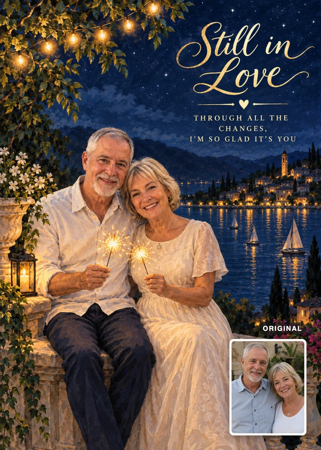
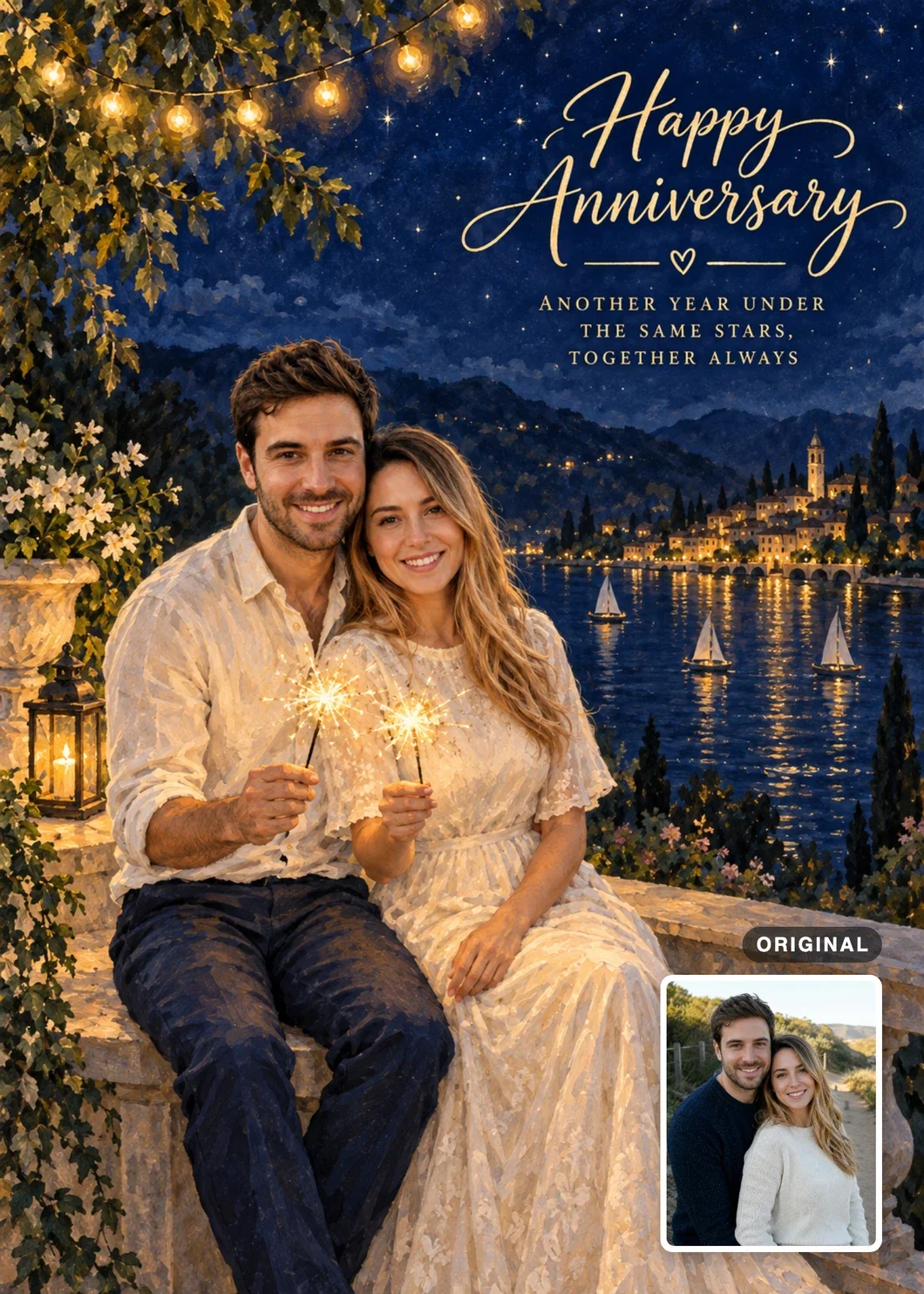

When we develop a design, we test it with photos that differ from what the design expects: a different pose or crop, two people instead of one, lighter or darker skin, glasses, a headscarf. A photo that already matches the design cannot show whether it will work for the next person. That kind of testing also raises questions you would not think to ask in advance, such as what a party hat in the design should do when someone already wears a headscarf.
If you are choosing between several photos, work backward from the design. A card built around a face may only need a clear head-and-shoulders image, while a design that depends on clothing, a particular stance, or two people interacting may need a photograph that shows more. Cropping can remove distractions, but avoid cutting away useful information just to make the source photo look finished before the design has even begun.
Give the cover one clear focus
Once the idea and the personal material are settled, the cover becomes a question of hierarchy. Someone should be able to glance at the card and understand what matters first: the recipient, a visual joke, a large greeting, or the setting itself. Problems often begin when the portrait, headline, decorations, props, and background are all given the same visual weight.
Start with the large relationships rather than the small details. Decide how much of the page the main subject should occupy, where the wording needs to live, and how much open space the composition needs. If a person is the emotional center of the card, elaborate decoration should not reduce them to a tiny figure. If a joke depends on a prop or an interaction, that part needs enough room to be understood without explanation. Empty paper helps here: it separates elements, creates emphasis, and gives the eye somewhere to rest.
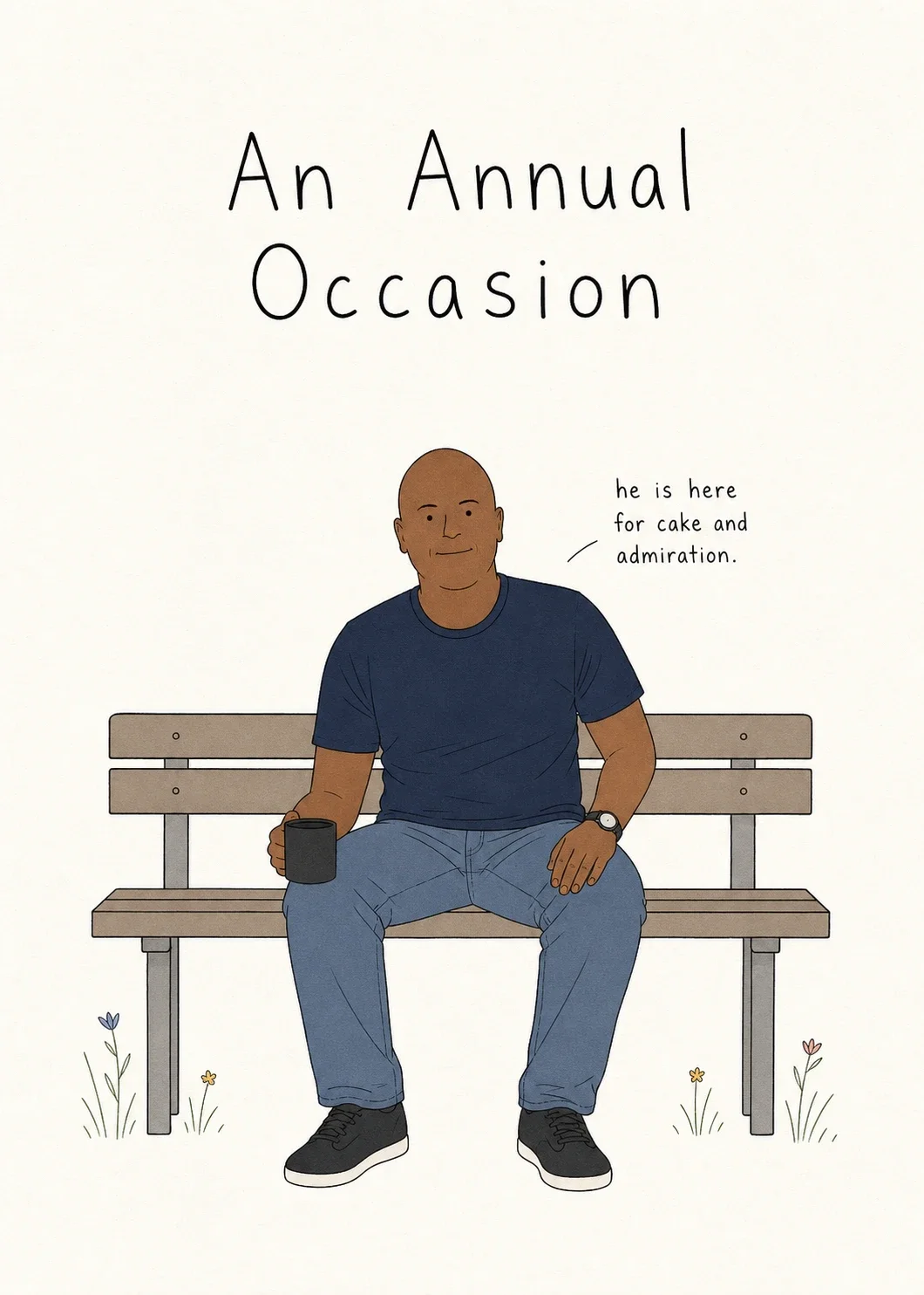
Style follows the same logic. Watercolor, cartoon, ink drawing, layered paper, collage, or a retro treatment all change the personality of the same basic idea, so choose a style for what it does for this card. The three birthday cards below show how far apart that can go. Birthday on the Bench uses sparse line art and a lot of empty paper, which leaves room for a dry joke. Paper Party Birthday builds a loud celebration out of layered paper. Dad’s Birthday on the Moon starts from a single sentence, the dad who would take one look at the Moon and say “I can fix that,” and its retro poster style makes the absurd scene feel intentional.


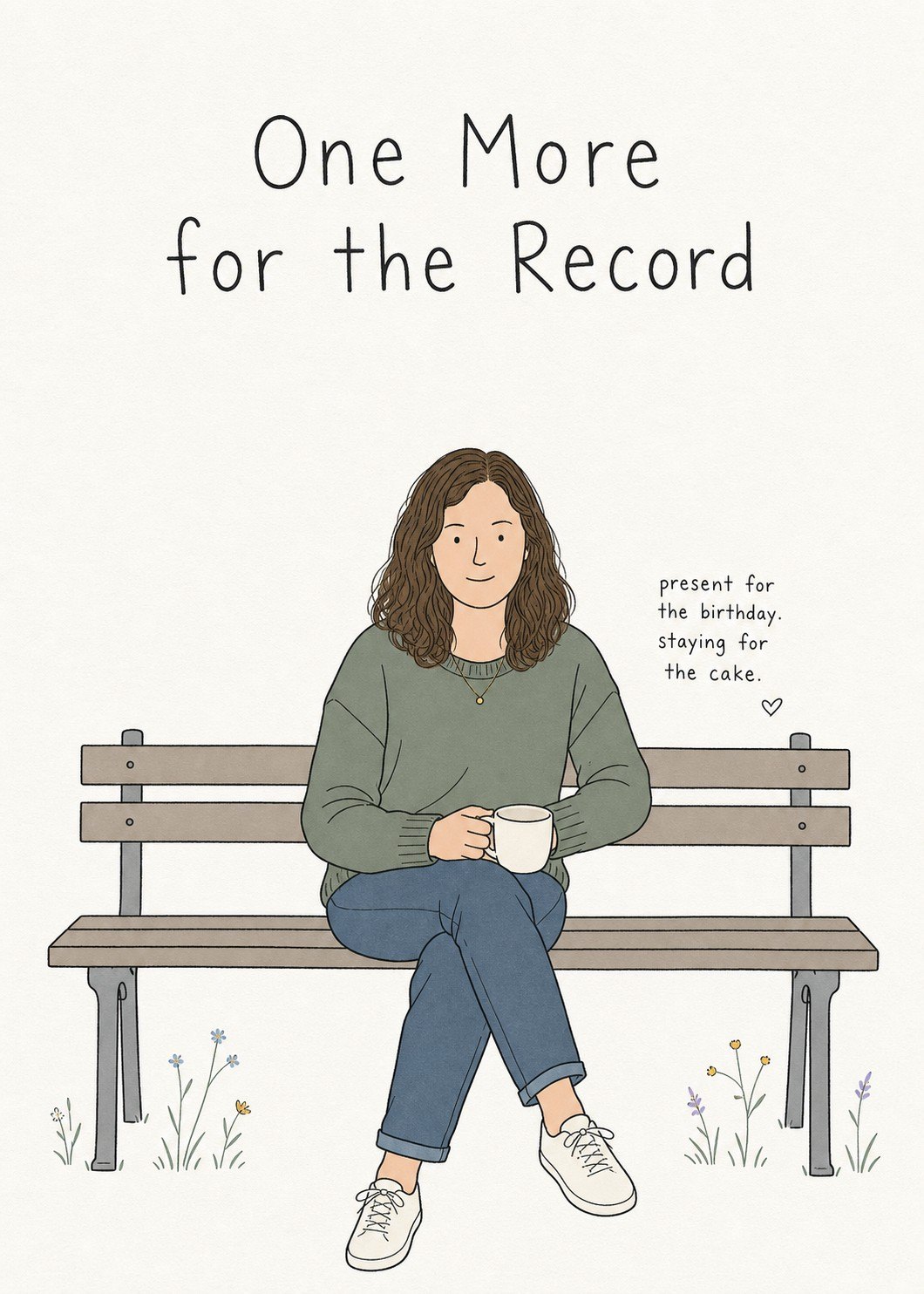
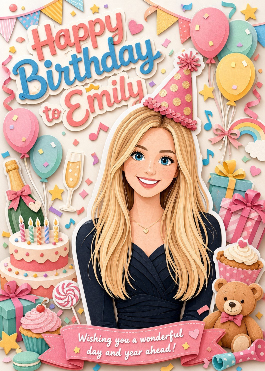

Color works best when it also has a job. One group of colors can set the atmosphere, another can support the person or the central object, and a few accents can draw attention where it is needed. When every color is equally strong, the design starts to feel noisy. On portrait-led cards, check what the palette does to the person. A warm background can make skin look muddy, grey, or uniformly yellow, and colorful brushwork that looks lively on a pale complexion can look like makeup on a darker one. In our own testing, these are some of the first things to drift.
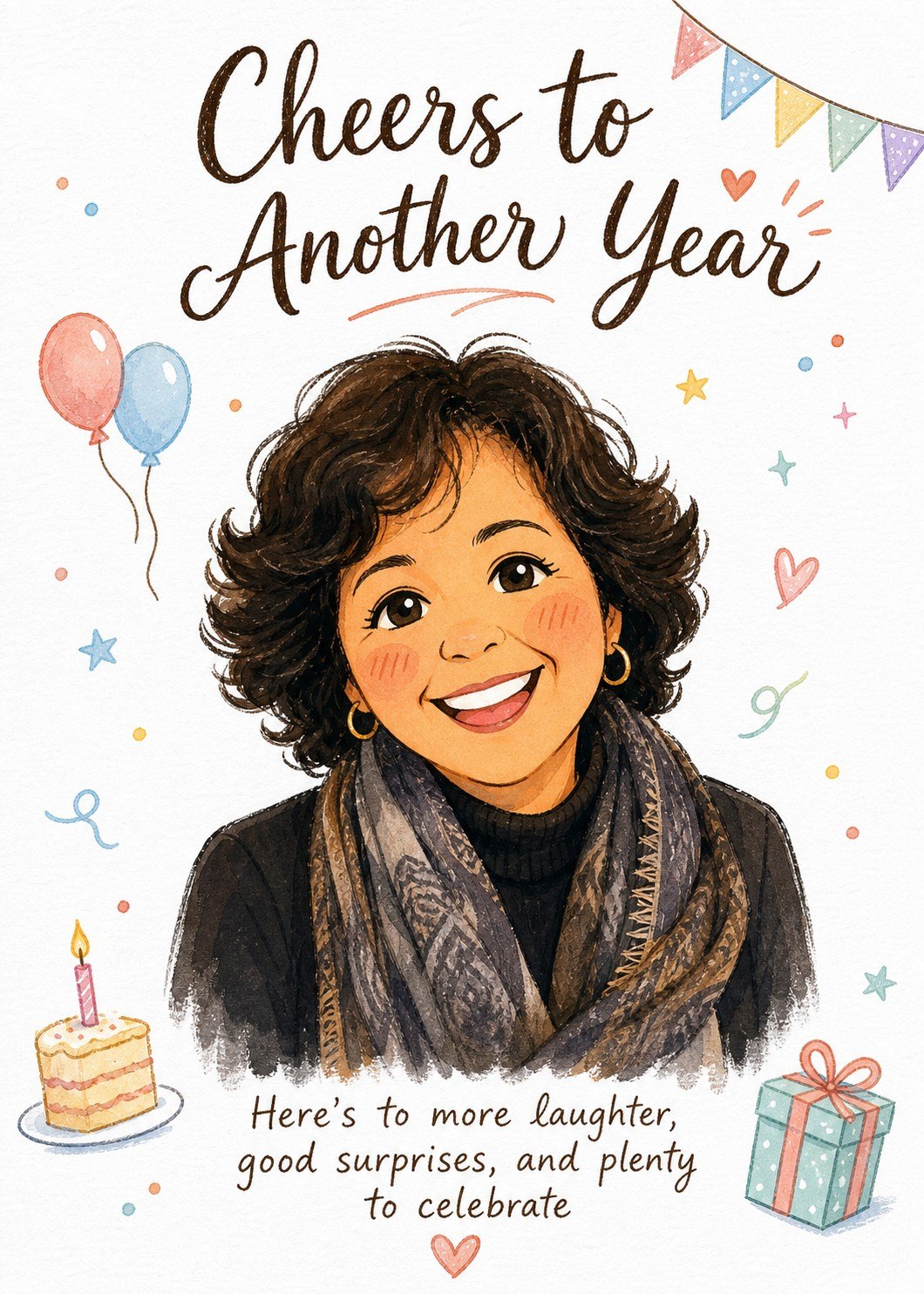
The wording belongs to the composition from the beginning. A title should not be squeezed into whichever corner is still empty after the picture is finished; its length, line breaks, lettering, and weight all take up real space. The picture and the words also do not need to repeat each other. Sometimes the image sets up the joke and the text completes it; sometimes a simple greeting establishes the occasion while the illustration carries everything personal. The most common surprise at this stage, in our experience, is a person who ends up too small once the title and decorations arrive. How We Make Cards shows how that played out on one of our birthday designs.
A useful check is to look at the cover much smaller than you designed it. If the first impression disappears and all you see is a collection of tiny details, the hierarchy needs another pass.
Make the inside part of the card
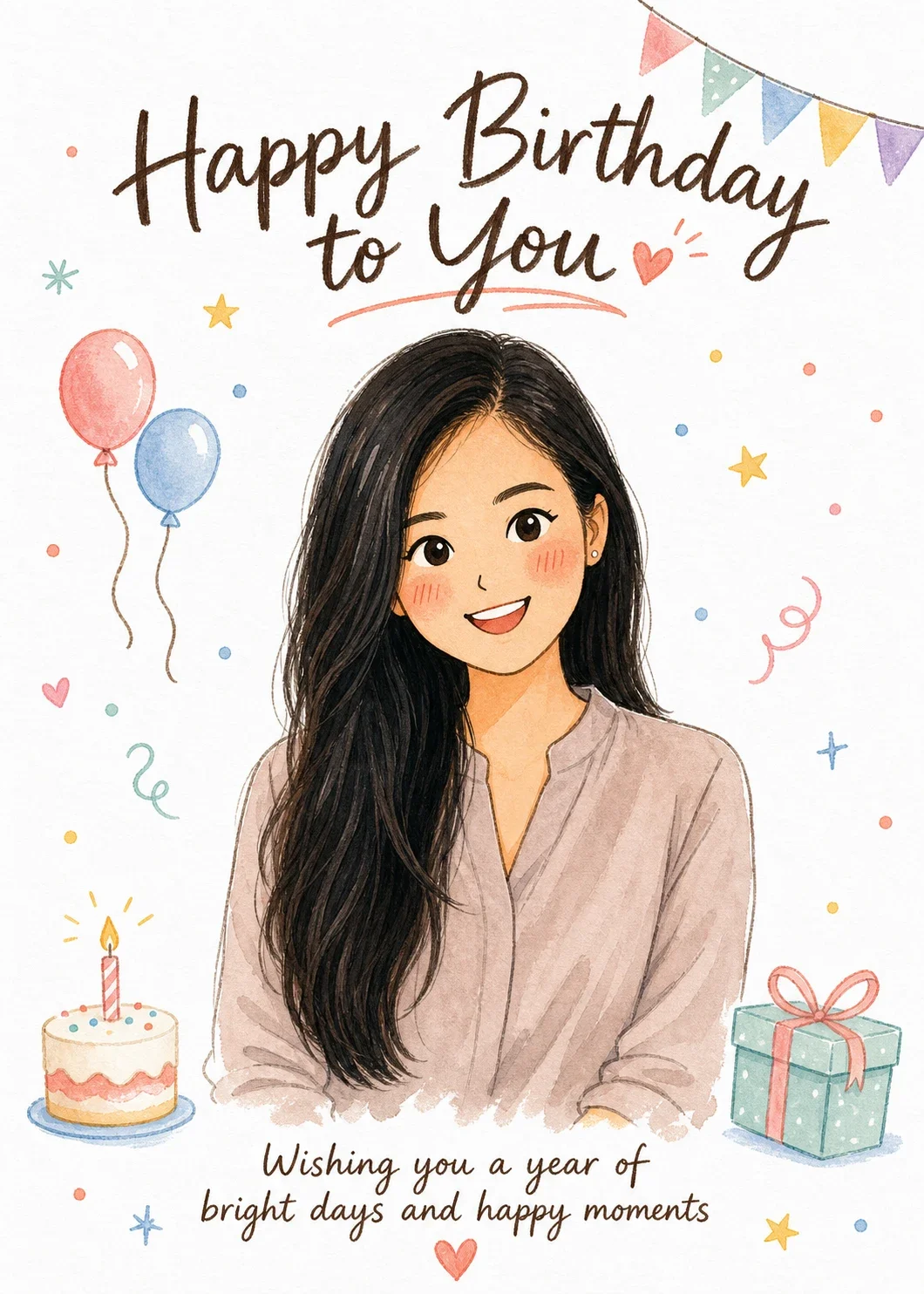
The cover attracts attention, but the inside is often where the personal part becomes specific. If the front already says “Happy Birthday,” the note inside does not need to say the same thing at greater length. On Birthday Balloons & Confetti, for example, the cover already carries both the greeting and a wish:
Happy Birthday to You
Wishing you a year of bright days and happy moments
So the inside can do a different job, such as mentioning a shared memory, thanking the person for something particular, or looking forward to something you will do together:
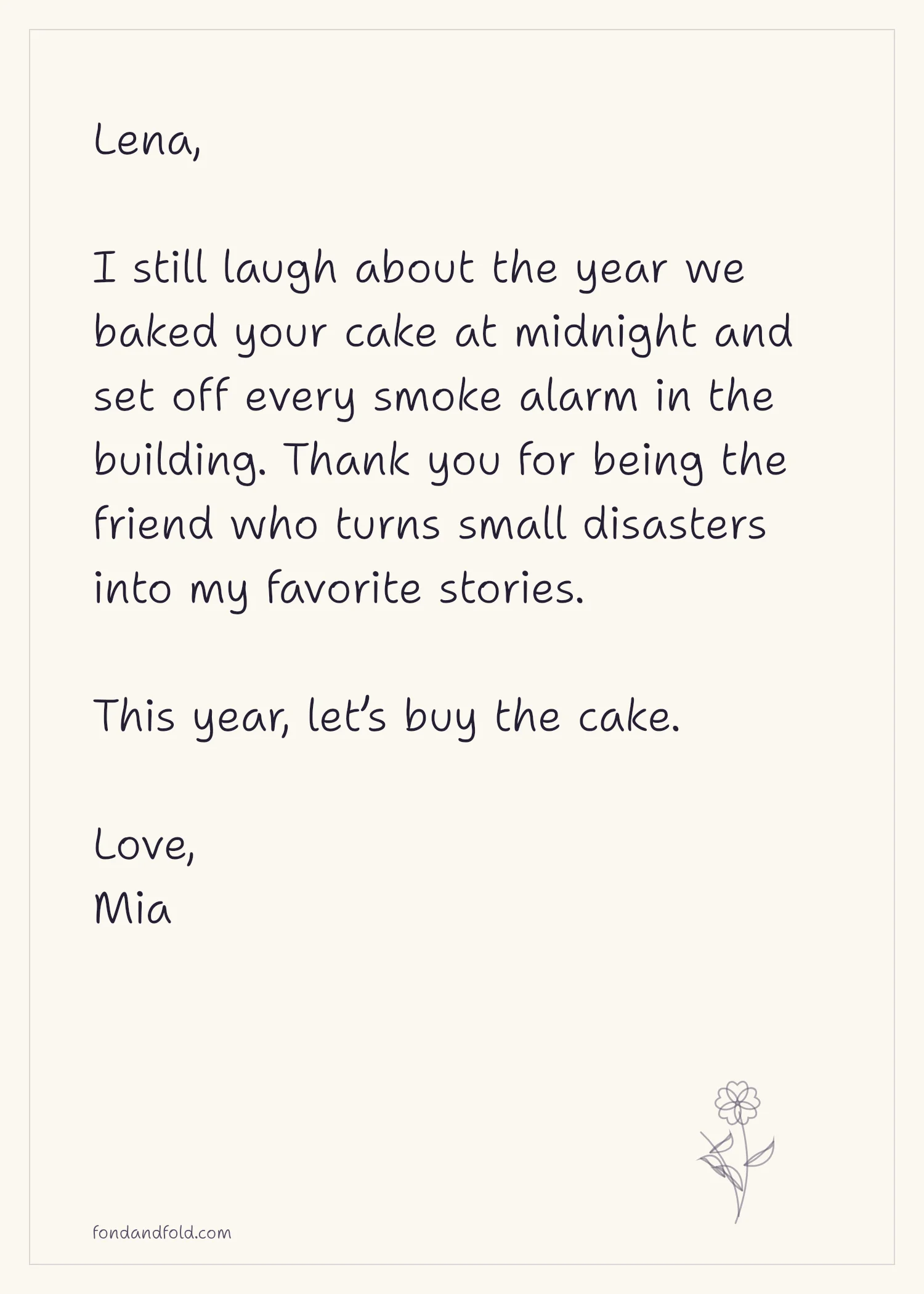
That division of labor makes both parts stronger. A visually expressive cover can lead into a quieter, more conversational inside, while a restrained cover leaves more emotional weight for the message. Either way, the inside should feel intentional rather than like blank space that happened to remain. Type size, margins, line length, and decoration all affect how comfortable the message is to read.
The cover and inside do not need to match exactly. Repeating one color, a small motif, a type style, or simply the same mood is often enough to make them feel related. What matters is that opening the card feels like continuing the same thought rather than entering an unrelated second design.
Check it at real size and as a whole
If the card will be printed, what looks good on a monitor is only part of the job. A physical card has a real size, a fold, edges that may be trimmed, paper with its own color and texture, and usually an envelope. View the design at the size it will actually be used. Fine lines that look elegant on a large screen can turn faint in print, and wording that technically fits may still feel too small in someone’s hands. Important details need breathing room from the edges and the fold, and artwork meant to run to the edge needs a print setup that allows for trimming.
The envelope is part of the experience too, even if it stays much simpler than the card. A related paper color, a small motif, or another restrained connection is enough to make the two feel considered together. Paper, scaling, double-sided printing, trimming, folding, and how screen color translates to print are covered in How to Print Your Card at Home, at a Print Shop, or as a Photo.
Toward the end, it is easy to spend a long time on one flower, one line of text, or one small color without looking at the card as a whole again. Step back and return to the original decisions. Is the first thing you notice the thing you intended? Can you understand the main idea without anyone explaining it? Does the personal part feel built into the card, or does it look like a name, photo, or message added after the design was finished? Then check the quieter parts: whether the text is easy to read, whether the decorations support rather than compete, and whether the inside continues the same mood. If the card will be printed, make at least one test at actual size; paper often reveals spacing, contrast, and type-size problems that are hard to see on screen.
Expect to go around this loop more than once. None of these decisions is hard on its own; what takes time is that they depend on each other. A larger title pushes the portrait smaller. A warmer palette changes the skin. A new photo shows that a pose only worked for one person. Changing one thing at a time, and keeping the version that worked, is usually faster than redesigning everything at once.
Designing a personalized card means making a chain of connected decisions: who it is for, what it should feel like, what makes it theirs, what the eye sees first, and what the inside adds. Getting them to agree is what makes a card feel considered, and it is also why a card you design yourself usually takes longer than you expect.
At Fond & Fold, we know how much time a good card takes, because designing them is our work. So we do that part in advance. Each design arrives with its art direction, composition, style, and cover wording already worked out, tested with many different photos, and offered with enough variations to suit different people and relationships. You choose a design that feels right, provide the photo it needs, pick the cover wording, and add the part only you can write inside. The card stays personal, takes a fraction of the time, and still becomes something the two of you remember.
The personal decisions are still yours: who this is for, what feels like them, which photo shows them clearly, and what you want to say. You just do not have to solve every visual decision at once. We hope the finished card feels less like filling in a template and more like finding a design that already had room for this particular person.
A personal card starts with knowing who it is for. The design helps everything else belong together.